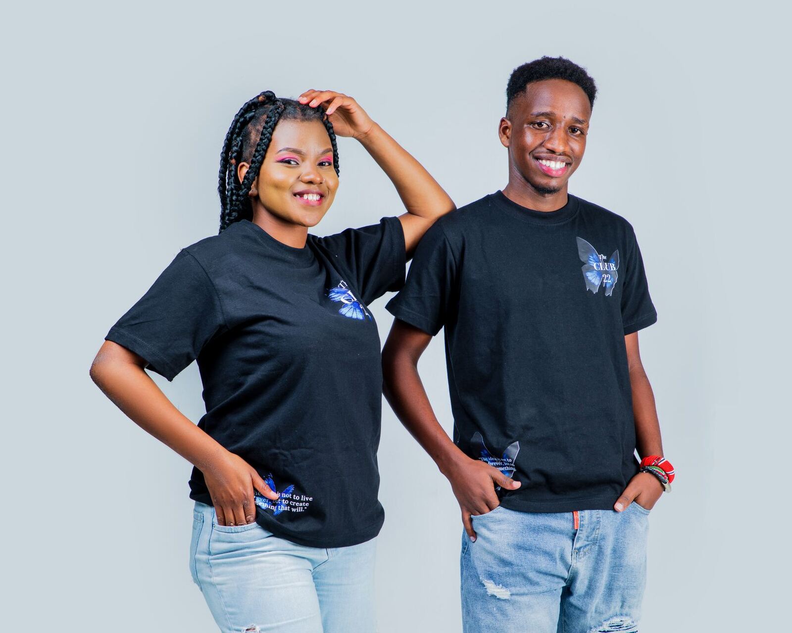
A red ink that looks correct on a white tee looks brown on a black one. The ink is not different. Cotton is translucent enough that the garment underneath changes what you see, and dark dye eats the colour above it.
The fix is a layer of white ink laid down first, cured enough to be printed on, giving every colour above it a white surface to sit on.
What the underbase costs you
An underbase is not a small addition. It is:
- One more screen to make, coat, expose, wash out and reclaim.
- One more print stroke per garment.
- One flash cure per garment, which is often the actual bottleneck.
- More ink, and white is usually not the cheapest ink you buy.
- Tighter registration, because a misregistered underbase is visible in a way a misregistered colour often is not.
That is why a two-colour design on black is a three-impression job. Quote it as two and you have given away a third of your press time; see how to price screen printing.
Choke it
The single most common underbase fault is a white halo. Cause: the white is the same size as, or larger than, the colours printed on top, so any registration drift exposes it.
The fix is a choke: shrink the underbase slightly so the colour layers overhang its edge. Roughly half a millimetre at print size is a common starting point; tighter for fine detail, more generous if your press or your operator is having a difficult day. The colour layers hide the edge and small drifts become invisible.
Mesh and ink
The underbase needs to be opaque, which usually means more ink than the layers above it:
| Layer | Typical mesh | Aim |
|---|---|---|
| White underbase | Lower mesh | Opacity, a solid white surface |
| Colour layers | Higher mesh | Detail, thin deposit, soft hand |
| Highlight white | Higher mesh | Crispness on top |
Note the two whites. The base white and a top highlight white are different jobs with different mesh, and using the base screen for both gives you a heavy, plastic-feeling print.
Halftones on top of an underbase
Halftones over an underbase are unforgiving: the dots must land on white, and a missing highlight dot is obvious. Keep the LPI within what your mesh can hold, and choke the underbase carefully so tiny dots at the edge of a gradient are not sitting half off the base. See halftones, LPI and mesh count.
When to avoid one
- Single light colour, simple art. A double stroke through a lower mesh often gets there with one screen.
- Deliberately distressed or vintage looks. The garment showing through is the effect.
- Tonal prints. Printing a darker shade of the garment colour needs no base at all.
- Very small runs. The extra screen may push a small job under your minimum; a transfer may be the better tool.
Cure the base, do not over-cure it
A flash gels the white enough to print on. Fully curing it at the flash stage and then curing again in the dryer can leave a stiff, cracked print. Flash to touch-dry, print, then cure the whole thing properly once, and check it with a stretch test as in the QC checklist.
The dark-garment tier, and why one price cannot cover both
A design printed on white and the same design printed on black are not the same job. The dark version adds a screen, an impression, a flash cycle and a slower press. Averaging the two into one price means light-garment customers are subsidising dark-garment ones, and the customers who buy black hoodies will find you before the ones who buy white tees do.
| Factor | Light garment | Dark garment |
|---|---|---|
| Screens | One per colour | One per colour plus base |
| Impressions per garment | One per colour | One extra, plus flash |
| Press speed | Baseline | Typically 25 to 40% slower |
| Ink cost | Colour only | Colour plus the largest white line |
| Reject risk | Lower | Higher, base registration and flash |
Two tiers, stated on the quote, is the whole fix. It takes one sentence to explain and it removes an argument that otherwise recurs on every order.
Flash cycles are the hidden throughput cost
The flash is where a dark-garment job loses its rhythm. On a manual press a flash means an index, a wait and a heat build-up in the platen that grows through the run, which is why the fiftieth shirt often prints differently from the fifth. On an automatic it is a station given up to heat rather than ink.
The practical countermeasures are unglamorous and effective: cooling fans on the platens, a slightly higher flash temperature for a shorter dwell rather than a long low one, and running dark work in a block so the press settles into one behaviour rather than swapping back and forth. Blocking work like that is a scheduling decision, and it is exactly the sort of grouping a production board should make obvious.
Measure a dark job against a light one
Every claim in this article is testable in your own shop in an afternoon. Run the same design, same quantity, once on white and once on black, and record the time from setup to last good print.
If staff clock on to the job, that comparison is a report rather than a stopwatch exercise: the job costing report will show the hours and labour cost on both, and margin after labour side by side. Shops that run this test usually find the dark job takes 1.4 to 1.8 times the total labour, and that their dark-garment surcharge was set years ago at a figure well below it.
Ink choice changes the whole equation
A high-opacity white that covers in one pass is more expensive per kilo and cheaper per garment than a cheap white that needs two. The same logic applies to low-cure inks: a lower cure temperature protects synthetics, reduces dye migration on polyester and lets the dryer run faster, which matters more than the price per tub on any job of size.
Dye migration deserves its own note. On polyester and poly blends, heat pulls dye up into the white and you see pink bleed through a white base days later. The answers are a barrier or blocker white, the lowest cure that still passes a stretch test, and testing the specific blank before you commit a whole order to it. That is a sourcing question as much as an ink one, and it belongs in your blanks comparison.
Printer's Friend flags white underbase automatically on dark blanks when you quote screen print work, so the extra screen and impression land in the price rather than in your margin. Terms like choke, flash and mesh count are all in the glossary.